Nightingale Apps
Identity
WHAT DID WE ACHIEVE WITH THE NIGHTINGALE APPS IDENTITY?
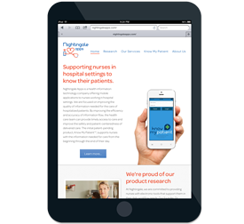
Nightingale Apps develops mobile apps for healthcare professionals working in a hospital setting. They needed a logo and color palette that promotes their brand within the health care industry. Working with founder, Tiffany Kelly, we choose a direction that employed a traditional health services color palette of red and blue and included some graphical elements that symbolize traditional uses for new technology. The result is a clean and healthy looking logo that speaks to nurses and other professionals who are working daily to collect and process information for multiple patients.

What does Nightingale Apps think?
“I began working with Be Better Studios in July 2013. At that time, I was looking to develop a company logo. They took the time to understand Nightingale Apps as a company and I was thoroughly impressed with the final design. Since then, we have developed the Nightingale Apps’ company website and other marketing materials. The website is fantastic and impressive to our visitors and us as a company. Overall, Amy and Ethan are talented individuals who are attentive, effective, and very professional with their clients.”
TIFFANY KELLEY, FOUNDER NIGHTINGALE APPS

