
Today I am going to begin to hand-letter. Well, ok, I started this project on Sunday. If you have hand-lettered before then you know the time and patience, sketching and drawing (and redrawing) it takes to get your lettered piece to a level of satisfaction.
I discovered a really great course thanks to Skillshare. Skillshare is a learning website filled with easy to follow tutorials. This passion project is based on the teachings of, Letterer, Mary Kate McDevitt. What I like about Mary Kate is she is a very talented lady for one and, two, I was attracted to her thoughtful approach to lettering. It’s not just about pretty letters sketched on paper but that the type styles come from a place of meaning and concept. Coming from a design background this is important to me.
Mary Kate’s lesson begins with choosing a phrase and finding a concept around this phrase. I have a notepad filled with Be Better phrases and it was time to put them to work. I chose the phrase “A better tomorrow starts with being better today.” I figured this will help inspire me as I create the lettering. This phrase is a bit more abstract in terms of coming up with visuals and style to incorporate into the lettering which made it quite a challenge. But hey, I wanted to stay inspired so I went for it.
I pulled the words: better, start, tomorrow and today, from the phrase to help me with my concept. Starting with these words I created a list of words that related in some way. From this part of the discovery process I knew in the end I wanted lettering that relayed movement, brightness and positivity. A start flag seemed important to me as well.
Better: Bigger, greater, more valuable
Start: Takeoff, start-off, running start, day 1, setting out
Tomorrow: World to come, to be, prospect, destiny, outlook
Today: Present, in vogue, modern, current
Following Mary Kate’s direction I then created a mood board that consisted of colors, images and typographic inspiration. I really liked the illustrated details and some typographic elements from vintage racing posters. Having visuals to refer too was a great help in finding clarity. Already I was asking myself “Is my phrase too long?” “What does a cursive T look like again?”
From the inspiration exploration phase it was time to sketch (over and over again). I’ve attached some thumbnail pencil sketches (there are many), from where I started to the final inked sketch. I had a lot of fun creating this hand-lettered poster and I look forward to working on the final product which will involve scanning the ink drawing and digitizing it. I will post the results as soon as I’m finished!

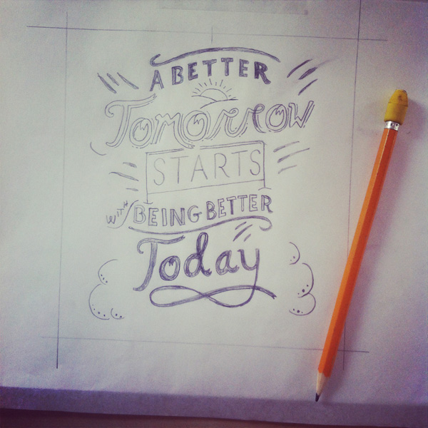
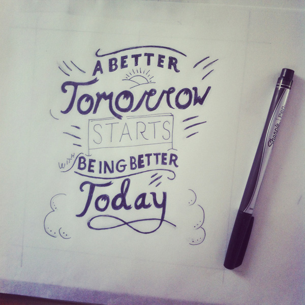
I found the process of hand-lettering to be quite time consuming and your hand and neck might hurt, from hunching over your sketches (for hours), BUT it is a lot of fun. I have a new found respect for professional hand letterers. Their patience and time spent creating beautiful typographic works of art not only continue to inspire me but also amaze me.
To visit the work of Mary Kate McDevitt
To visit the Skillshare class with Mary Kate McDevitt
I love hand lettering. I’m not as good as I want to be but I love .I always took pride in handwriting. Nice blog.
Hi Christinia! Thanks for your comment. Hand-lettering, when done well, is amazing! I am inspired by the pros and because they are sharing their process with others it makes creating unique letterforms so much more accessible. Since I posted this I’ve started my passion project over from scratch (happy to report progress has been made). I plan on posting version two in the next day or so. I hope you’ll check it out! Cheers!